Look out for the big T: new transit station markers are here
Look out for the big T: new transit station markers are here

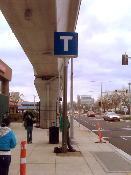
Hey hey — look out for big white T signs at three Canada Line stations.
The T signs are our new transit station markers, acting as beacons to help you to spot the location of transit nearby. (The T stands for “transit”.)
They’re planned for the entire system, but we’re putting them up at Marine Drive, Bridgeport, and Richmond-Brighouse Stations first.
So why are we doing this?
Well, the big Ts are part of our new wayfinding standards: that is, a new system of signage and information sharing to help you better plan trips and get around our system. It’s a really big project and we’re still hard at work on it.
As you also probably know, cities worldwide have similar markers to help wayward riders find transit services. For example, London has its famous red, blue, and white roundel logo to help you find transit.
How the Ts work

The large Ts, which are 1m square and stand 6m tall, are meant to guide you to a nearby station or exchange. Maps inside the transit facility will then help you figure out where you’re going.
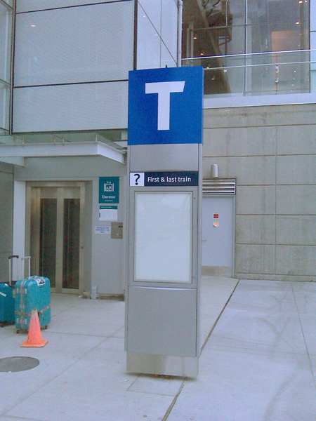
But since a tall T beacon isn’t necessarily the best sign for all locations, we’ve also put together an alternate, shorter blade-type marker. It’s slated to have both the T and additional information.
By the way, the maps inside the stations and the alternate marker are also part of our new wayfinding system.

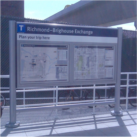
These new maps include a simplified regional transit network diagram, which has already begun to appear on the system.
There’s also a diagram showing the routes of buses leaving that specific facility and where to catch them, and a walking map showing destinations that can be reached on foot from that facility, for customers arriving on transit.
And these maps have already been installed at three Canada Line facilities: Marine Drive, Bridgeport, and Richmond-Brighouse.
So what’s next?

Well, for the Olympics, we’re also hoping to get some Ts and other wayfinding signage installed in downtown Vancouver.
However, that project depends on installation and approval timelines — if we aren’t able to put them in by December 31, they will go up after the Olympics.
And for the future, we’re hoping to roll out these wayfinding elements further across the system.
But I’ll keep you posted on that — we’ve got to see just how much our current funding situation will allow us to do.
Let us know what you think!
Please let us know what you think of this signage — feel free to use the comments or the Buzzer’s e-mail address to send in your thoughts. Your feedback is more than welcome, and any questions will be passed on to the planning department for answers.


[…] The Buzzer blog » Look out for the big T: new transit station markers are here buzzer.translink.ca/index.php/2009/12/look-out-for-the-big-t-new-transit-station-markers-are-here – view page – cached New T markers will be posted at three Canada Line stations this December. This one is at Richmond-Brighouse Station. […]
t is for terrific
Looks terrific! Budgeting is always an issue, but they would look really cool if “next train/bus” style information was integrated into the displays too.
Great idea — it’s tough to find subway stops downtown, even if you know approximately where they are.
Well, I think it’s hilarious considering people can now find their way to the stations where they will find maps that are wrong :) Case in point are the Transit Connection Maps in the Expo, Millenium and Canada Line Stations There are a number of errors on the list of SkyTrain stations that appear on the Transit Connections Map, including (1) The fact that Burrard is missing (2) Coquitlam Central is listed as a station even though the Evergreen Line hasn’t been built (3) Commerical – Broadway is listed as Commercial and (4) Production Way – University is listed as Production Way. I previously infomed TransLink Customer Service (Feedback ID 168013) on September 16, 2009, but all I got back was a form letter reassuring me that the right people have been notified. Nothing has changed and the world is about to visit us for the 2010 Olympics.
I guess it’s a start. Since the Canada Line started operation I have been asked twice by people outside the Ugly Concrete Brick, I mean the King Edward Station, whether the bus outside was going east or west. Perhaps you could figure that out from the map inside, but it might not be easy for everyone.
Excellent. The T is internationally recognised as a pointer to rapid transit. It can also stand for “Transit” or “TransLink” even.
Let’s hope that YVR adopts this too. I’d like to see it used on bus stops and bus loops too.
Are these signs illuminated? It looks like they’re built that way…that’ll be very good at night, especially during these long, cold winter nights.
By the way, this is a very nice touch. No doubt it will cost some money, but the intangible benefit in establishing a simple, clear brand identity is critical–especially for a large system with so many utterly diverse kinds of operations (buses, B-Line, Community Shuttles, SeaBus, SkyTrain, West Coast Express, TrainBus, HandyDart) that lack any kind of singular visual messaging.
…And maybe we will finally have a distinct, recognizable icon for transit in this city, like the London Transport logo or (my personal favourite) Montreal Metro signs.
I saw the T at Richmond-Brighouse earlier in the week and I was wondering what the hell it was for. I was going “well… it can’t be T for Taxi…”
This is a good move, especially for stations downtown that are literally tucked away (Granville Station).
I did notice though that on those metal boxes at Canada Line Station bus bays they don’t list Main Street-Science World on their SkyTrain system diagram.
I think it’s a T-errific idea. It would definitely be much easier to spot a SkyTrain station, especially in the downtown core. Hopefully, Vancouver will catch up other cities that have distinctable markers like Toronto’s transit logos, and London’s underground logo.
Like Stefan, I too wondered about illumination. I’m not a big fan of dark blue. No “electric blue” or a brighter shade would really get my attention, but may lost constrast with the white T. This is going to take some getting used to.
Looking at the pictures, I agree with Tsushima, a bare “T” creates confusion. Having the station name below it helps to explain what the “T” means.
Now can we get some wayfinding on where the CLine doors will open so we can stop the CLine shuffle each time the train enters the station and we are chasing the doors?
@ Gary. Coquitlam Central is a station, and has been since 1995.
[…] Read more here: The Buzzer blog » Look out for the big T: new transit station … […]
Maybe the signs at the Canada Line stations should have a Canada Line logo on them and the ones at SkyTrain stations should have a SkyTrain logo, plus the “T”
I think it is outstanding to see Translink finally adopt a single icon for transit.
It is unbelievavbly late in the game for the Olympics and signage and maps are absolutely necessary in time for the Games.
I do hope the signs light up. It is so odd that the Canada Line signs do not and I trust Translink will correct that error soon.
My one criticism is why, of all places, are these signs not being introduced first in downtown Vancouver? The elevated Richmond and Marine Drive stations are those in the least need of identification as to their purpose.
Also what happened to the signs on the bus top poles at Brighouse when the C-Line first opened? One could simply syare at the 4-sided retangular boxes to determine the frequency of the #401 how often it comes and its important stops. Why are the bus stop poles now bare metal?
It could be that they are updating it for the December schedules. If I remember correctly, there’s a big shuffle of bus stops at Brighouse coming up tomorrow.
When I first saw this a week ago, I thought it’s intended as a landmark where transit commuters can conveniently bang their head against the metal pole when their bus never shows up, or if they JUST miss a bus and helplessly watch the bus pulling away! :P
Hi folks, here are the answers from TransLink planning to the questions you’ve raised:
Map errors: Have been passed along to our planning staff and any corrections will be made.
Illumination
The T beacons and monoliths (the Ts with embedded maps) are designed to be illuminated. I understand they are still working out some last details with electrical connection in Richmond/Marine Drive, but we expect this will be resolved soon. For the hardware that will be installed at in downtown Vancouver later this month, the new station entrance name signs (at Expo/Millennium Line stations) will be lit. Most of the T beacons in downtown Vancouver, however, will not be illuminated at first because we have yet to secure agreement on where we’ll be allowed to draw the power from in most cases, and there are some issues with conversion of voltage to be resolved depending on the power source. It’s more complicated than a person might think. We’re working towards resolution, but didn’t want these issues to hold up the installation in the meantime.
Infocubes.
At Richmond-Brighouse, two new bus bays (6 & 7) were added Dec 14th, and bus bay assignments rearranged. The infocubes were taken down so the incorrect information would not still be posted. Infocubes will be reinstalled shortly with the updated information.
Location — why not downtown Vancouver first?
New wayfinding was installed first at these three Canada Line stations just because we had the opportunity as they were new bus exchanges connected to stations (the other Canada Line stations don’t have the same level of bus activity, so weren’t strong candidates). The maps, map furniture and the infocubes were installed in the bus exchanges when the CL opened, but the design and manufacture of the T beacons and monolith had a longer lead time. As for downtown, you should be seeing some new T beacons, entrance name signs, maps and platform signage at Expo/Millennium Line stations downtown starting later this month.
Hey!! I already fiound one of the new T’s on Granville Station. Hah!! :)
Ooops! “found” not “fiound”
I noticed the new wayfinding maps at Richmond-Brighouse, which are excellent, but they are oriented wrong. The map is oriented with north up, but as you look at the map you are facing south! Very disorienting. Maps should be oriented according to the direction you are facing. Just cross the street to Richmond Centre mall and you’ll see this is what they do for maps of the mall, it’s just common sense, no?
Ryan you raised a good point. Perhaps this should go to a weekly poll.
Then again, you should get involved with the compass rose debate outside the downtown CLine stations. Should the rose North be geographic North, Magnetic North (changes every year), or street North as the Vancouver peninsula streets are angled.
Ryan: I sent your question over to our planning department, and here’s the response.
[…] talked about the new T transit station markers last time, but even more wayfinding signage with the T identifier have been put up. That includes […]
I think a bus or train logo should be used instead of a T. Many countries use a logo or pictogram instead to identify a major subway system.
I THINK IT IS GREAT IDEAL FOR THE VISTORERS TO FINE THERE WAY AROUND TOWN DOING THE GAMES
[…] another look at some of the new station signage at Stadium-Chinatown, too! The countdown […]
[…] Look out for the big T: new transit station markers are here […]
Jhenifer,
I’m curious, as I’m sure many other people are, as to why none of the Canada Line stations seem to have any prominent, illuminated signage. Even on clear evenings, it’s next to impossible to figure out where any of the stations are. When it rains, the stations are practically invisible. The little mini lights above the signs provide very little, if any, illumination. Are there any plans to change this?
Thank you.
The T is fantastic, it really represents Vancouver becoming truly global! The T itself is beautiful, reminds me of the S bahn or U bahn in Germany, personally I thought it stood for “train” but ‘transit’ makes sense too.
Love it!