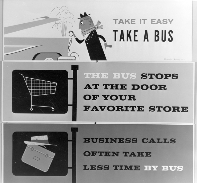
Vintage Vancouver transit ads from 1958
Vintage Vancouver transit ads from 1958

I recently visited the delightful City of Vancouver Archives and with the help of the wonderful research staff, I looked through some vintage B.C. Electric pamphlets and photographs that aren’t available through their online catalogue (or at least as far as I know). I thought you’d enjoy seeing these classic ads I found—well, the ad may be classic, but the message isn’t! Aren’t the drawings fantastic, by the way?


I t reminds me of the Miroslav Sasek books I read as a kid! (“This is London”; “This is Paris”, etc)
[…] This post was mentioned on Twitter by The Buzzer, Greg Burnham and TransLink BC, iSkytrain. iSkytrain said: Vintage Vancouver transit ads from 1959 http://ff.im/-uNEB5 […]
Fantastic!
Will you be sharing more of your finds with us in the future?
Gasp! The ad uses the spelling “favorite” instead of “favourite!” Perhaps they couldn’t fit the “u” in the space of the ad- the text looks pretty tight. And I always thought that using “favorite” was a more recent trend!
I think it would be very cool to see a few of these ads up today!
Sewing: Of course I’ll share my other finds :)
Cliff: It would be cool, wouldn’t it? I think colouring them would be pretty awesome as well.
Very retro…and with the popularity of Mad Men these days, there must be a niche audience for high postwar graphic art.
Interesting to see that one ad with the sans serif font. I was under the impression that sans serif fonts in advertising is a more modern trend. Paradoxically, it’s been noted that serif fonts are easier to read.
It’s really the simplistic quality of the art that has the appeal for me. It’s easy to see at a glance that the man in the first advertisement is visibly frustrated with his vehicle. My eyes don’t have to dart around and examine the details. Great advertising if you ask me. I would imagine an ad like that if run for a short while would get a lot of attention because you just don’t see that anymore. When was the last time the general public saw any contemporary advertising from the 1950s?
That top ad would look great on the side of a bus, if you ask me. It’s the perfect advertisement to display to motorists. The icing on the cake is all the (hopefully) happy and content people in the windows above it!
[…] gem I found in the B.C. Electric paper files at the City of Vancouver Archives, along with the classic transit ad I posted before. (The brown streaks are glue—the poster came out of a paper […]
[…] […]