Predictive departure times for real-time Next Bus
Predictive departure times for real-time Next Bus
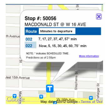
- This is one internal beta version for predictive bus departure times in map view.

In simple terms, the main question that the new TransLink mobile website has been trying to answer is: Where is my bus? Having GPS on our fleet and using the new website to track the location of buses has provided a solution to that question. Now, with the website nearing the end of its beta testing, the mobile website team is aiming to answer yet another question: When will my bus be departing from my bus stop? Providing customers with the best information to do this based on the data our systems can gather is our approach to this new and very important question. And it’s a question I hope Buzzer blog readers can help us address.
Throughout the beta phase of the new mobile site, the mobile team has been collecting feedback on the new website from Buzzer blog readers. This has been done via the comments left by readers and two in-person user testing sessions (one in August of last year and one early this month).
During this last (predictive) phase of the mobile website development, the mobile team would like to ask readers what predictive information they would like to see and how they want to see it.
How to provide predictive information
Besides data that provides the physical location of buses, which is translated into the image of a bus on the map of the mobile website, there is other information that can help customers get up to speed on the buses, routes and stops they want to know more about.
When your bus is estimated to depart from a stop

The mobile team now has this information and is working on how best to convey it on the website. If you want to know when a bus will depart from a particular stop, all you have to do is enter the 5-digit bus stop number into the Next Bus search bar, and voila, the predicted departure time of your bus will appear.
Although Next Bus has been using Google Maps text bubbles (as shown in the example above), with predictive text, the mobile team has realized that doing so has limitations. Besides the functionality problem of when the bubble is live, the user can’t move the map. The bubble also isn’t big enough to hold enough scheduled info. Due to these drawbacks, the mobile team decided the text view was a good place to provide more detailed rider info. If you search for bus routes associated with a bus stop number in text view, you’ll see that the predictive text view allows customers to view the scheduled and predictive bus departure times. It also indicates when a bus has already passed by striking out that particular departure time. Another nice feature of predictive text view is the ability to show the bus #ID number if it can be identified by the system. If the information is not available, it will show up as “0000.″ Otherwise, it will show up in its usual four-digit ID number (e.g., 2181).
How other agencies show predictive times
Chicago’s CTA Bus Tracker mobile site shows predictive time, but no scheduled times. TriMet’s (Tri-County Metropolitan Transportation District of Oregon) TransitTracker, their mobile website, shows both predictive time and scheduled time.

It could be said that showing the scheduled times when the predictive times are available is useless since what really matters is when the bus is actually going to arrive at a stop, not when it’s supposed to be there. Others might say that it’s good to have both times, so users can roughly plan their future trips.
What do you think? Would you like to see both predictive and scheduled departure times or just predictive?

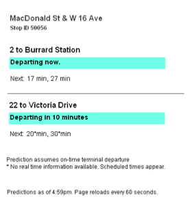
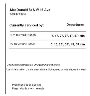
Next comes the important question of how the predictive text will be presented. One version of the map view of the beta version of the predictive feature (used for internal testing) indicates the exact time that a particular bus will depart a particular bus stop (e.g., 4:23 pm — see screen capture at the bottom of the post). Some systems like TriMet’s mobile website use a count down clock instead (e.g., 24 min). The advantage of showing the exact time of day that a bus will depart is that you know the time that you need to be at your bus stop to catch your bus. The drawback is that not everyone is operating on the same time. My smartphone may not show the same time as another’s smartphone, let alone someone’s wrist watch or other time keeping device. The advantage of using a count down system (as shown in these two screen captures of the beta predictive text view to the right and above) is that you’ll know you’ll need to be at the bus stop in 24 minutes no matter what time you have. The disadvantage of this system is that it requires users to do some math in order to figure out the exact time they need to be at a stop. This may be easy for departure times that are single digits, but this is more difficult and more prone to error when you need to add 53 minutes to the present time to not miss your bus.
Do you think predictive time should be shown as the time of day of departure, a countdown to departure or some other way?
Other data that can be provided

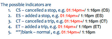
We also have access to other data including when an extra bus is added to a route, when a bus’s trip is cancelled and possibly when a bus is on a detour.
Now that we have some clear questions for Buzzer readers to weigh in on, it’s time to discuss what’s the best route for TransLink’s predictive real-time bus departure feature.
I’m genuinely elated about being able to know when I should be at the bus stop. I’m also tickled that the Buzzer blog community can help shape how it will work and look. Besides these two questions, we’re looking for feedback on all the features of real-time bus departure times. So put on your thinking headgear, readers. The future of the mobile website depends on it!


I would prefer to only see predictive departure times, and would like to see it as a countdown to departure. Thanks for asking for our input!
I see little reason to have the scheduled times. Schedule times are rendered obsolete by systems like this.
I would prefer actual times, rather than countdown. Most phones and computers have their clocks set automatically so people don’t lose sync that much during the day. Everybody who is looking at this site will have a clock at hand.
One thing I would _really_ like added is an error value. The bus will likely leave at 4:45pm+-4min. I’m sure you could do statistical analyses or something.
Take the option that uses minimal text (and white space) to maximize screen space for the map.
Consider applying colors like blue for ahead, red for behind and green for on schedule. Yes, numeric information like 10 minutes behind is very useful. A slow bus can mean one that is seriously loaded and not taking passengers at the stop I’m waiting at.
One of the biggest issues I’d like resolved is to put the current time on map. After getting the map, I find myself needing to exit the browser to see the current time, or checking my watch (which can be slow or fast).
With the GPS updates at 2 minutes and there’s 60 seconds in a minute. Predictive times can be interesting with stop lights (hitting a series of reds or series green). It’s still a little luck to meet a bus at the last minute or missing it.
I guess when the bus left in 5mn, you want to have count down information: “bus due in 5mn”, but when you have time to get a coffee break before the bus arrive, you probably prefer to have information like “bus due at 4:30pm”.
But what I would like to know is whether Translink planes to outfit its bus stop with QR Code like increasingly done elsewhere to make the whole process easier ?
see picture
http://xwiki.staging.obanyc.com/bin/download/Help/FindingAStopCode/MobileQRCode.png
…another lowcost measure, but giving big return…
I would prefer a countdown to maximize map space, and also maybe you could move the “close” button for the bubble to the bottom left, so that I won’t have to move the map first before I can close the bubble.
;-)’s suggestion to show a bus in red if it is full and has to pass stops would be wonderful to have as well.
Thanks, you’re making good progress!
Hi everyone!
RHT: I believe the mobile team is leaning towards countdown at the moment. But that doesn’t mean it can be changed.
Ross: Having everyone on the same time is tricky. I assume that most people using smartphones are on the same time. However, you can override the Rogers/Telus/Bell time and do it manually which could put someone off time. It would be great if everyone was on the same time, but in reality they aren’t so that is being taken into consideration.
;-) Putting a clock on the mobile site itself if something I asked the team as well. The drawback to that is that a clock would take up some valuable real estate. I still think it’s not a bad idea though.
Voony: QR codes isn’t a bad idea at all. I know the pickup on them in general in Canada isn’t great, but elsewhere in the world people are using them more and more. I know the planning department has been looking at this. I’ll follow up with them. Nice thinking!
I think the site you like depends a great deal on the capability of your phone.
I’d love to be able to afford an iPhone, which would make a graphic app like CTA’s seriously cool. However, I’ve got a minimally web-capable phone that can read text e-mails, so I’d want the text-based solution.
For my vote, the third beta screen, with predicted time to arrival the default. I like seeing multiple routes close together on one screen, as frequently more than one route will take you where you want to go. I may be more mellow than some (what would you expect for a guy with a text phone?), but a predicted arrival less than 2-3 minutes is soon enough – just say “arriving”, then drop it off the screen when prediction is less than 30 seconds – by then I’ll either see the bus or have missed it anyway, so don’t tease me with the bus I’ve just missed. If I do catch it, I get a bonus.
I vote for actual time, it feels more meaningful and for example is more useful in checking your watch while walking. “The bus will be there at 4:45” requires less thinking when comparing against a clock and is more consistent with comparison to how actual schedules are displayed.
I’m in favor of hybrid.
Countdown for less than 15-20 minutes, scheduled time after that.
More importantly, if feasible… always use scheduled time for any bus that isn’t actually on the road yet i.e. hasn’t departed the station/loop.
UNLESS the bus is late to leave the loop, then switch to countdown to account for that automatic lateness.
There’s space on the top toolbar to show the current time … Move the current controls slightly to the left and stick the current time to the right. If necessary make the fonts smaller.
With regards to space concerns, don’t forget you can also put some of the information on the text site.
http://nb.translink.ca/Text/Stop/50712
Keep the scheduled time at the top first row
2nd Row can be the projected time
3rd Row can show minutes to stop
4th Row can show minutes ahead or behind schedule
5th Row can show current, daylight savings, GMT, and HKG time
6th Row can show projected accuracy
7th Row can show time the bus last reported its position
8th Row can show minutes since the bus last reported its position
9th Row can show the bus number
What other information would be helpful or available? Capacity? Weather? Mileage?
Can’t the site have both options?
(countdown as default, actual time as a selectable option)
It’s the internet people, it’s flexible!
Also, get the API out, and let others figure it out. There’s no single solution that’ll work for everyone. We need different tools/sites/apps for different users/phones/etc.
In future, something I would like to see is that the \live\ buses are actually live. You know, how on the iPhone, when you’re in GPS mode, there’s a blue orb that moves with you on the map. If the TransLink buses actually moved on the map that would be great instead of having to actually refresh the page.
Actual time is much more intuitive. When I looked at the example above, my brain just froze – I had ot figure out those were not minutes past the hour, but minutes from now. That’s awkward. If space id a problem, then I suggest somthing like this
PM 2:38, :43, :53, 3:03; :13, :23; :33
I still use SMS stopID a lot (no data plan). I hope the SMS feature can show the same GPS data for the actual arrival times vs the current scheduled times.
I vote for actual times, and show current time vs count down as then you need to see when the data was presented (“as of Xpm). After a couple times using the feature, one should be used to knowing their watches are always 5 mins ahead or behind Translink’s.
As for Sorting (for SMS, and mobile site), I would like it to sort by time, then bus, as I sometimes have a few bus choices at the same stop, vs the current sorting by bus number.
I’m not rich enough for an iPhone. I’m very impressed by the CTA (Chicago) site which uses google map, and accessible by regular computers at home. If I could use this feature at home, it would improve my life greatly as to know when to step out to catch my bus.
I hope this wonderful tool won’t be limited to the iPhones and Androids, but be available via the good ol’ Windows PC as well.
“What other information would be helpful or available? Capacity? Weather? Mileage?”
I’d also like to see the speed, number of passengers on the bus, cabin temperature, sex of the driver, if the bike rack is in use, tire pressure, fuel level, windshield washer fluid level, whether the seats at the front are folded up, if the stop request sign is currently lit, and if the check engine light is on.
No matter how good the GPS tracking gets, red lights and green lights play a major factor in this sytem. Say the bus is 2min away, and it hits a red.. how should the timer react? Having a count down to the second is asking far too much, times are estimated because driving is estimated. Let alone with random stopping times, potentially disabled passengers etc. I feel that any information within a 2-5min window is acceptable. As riders we need to take some ownership on being there on time, acknowledging that driving fluctuates quite heavily. Especially for buses. With that said there needs to be some information if a bus is trending to be early and they should be following the timing points to keep them from getting too far ahead as some places do have horrid connections.
[…] visit the TransLink office and test out the predictive departure times feature of the website. Later in February, we asked readers how they would like to see predictive departure times integrated into the […]
[…] […]
If an option to show the actual time is chosen, is it possible to provide a preference for 12-/24-hour clock?
Same applies to date format – provide a user setting for mm-dd-yy, dd-mm-yy and yy-mm-dd formats, all of which are in use in Canada.
Nick: sorry for the delayed response. Our mobile site team said that this formatting is possible, but not super likely unless we get a great deal of requests for the function. As well, we’re going to eventually launch an API for the Next Bus info, so that can certainly be developed by third-party programmers in the future.
(PS: you can formally file your request via our customer information form!)
Thanks Jhenifer! Will file for sure.