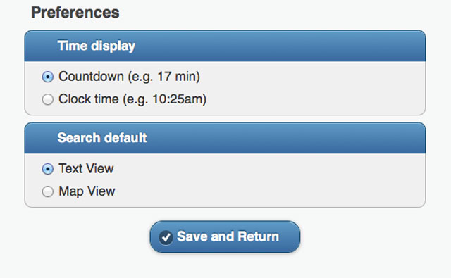
Preferences added to the new Next Bus
Preferences added to the new Next Bus

The latest addition to our Next Bus service is the Preferences feature. You may have noticed when visiting Next Bus recently that there’s new a pop-up screen informing users that they can now choose how they want time displayed in respect to bus departure times as well as if they prefer text or map view as a search default. Previously, the service only provided a countdown to bus departure times. Users also had to choose either text or map view for every search they conducted.
The addition of preferences is a result of customer feedback, including the feedback provided by Buzzer readers to our blog post asking how we should display time on the new Next Bus.
In other mobile news, we’re still planning for a summer/fall release of our predictive times API. Stay tuned, everyone!


I’d like a countdown to the next train clock at all the Skytrain stations instead of just at Canada Line stations.
Sheba: Funny, I just answered a similar question via our YouTube channel. There aren’t any plans in the near future to add countdown clocks to the other SkyTrain stations. However, it would be great!
@Sheba
While you’re at it, lets add a countdown until the door closes on the Canada Line display boards. Though this would require an upgrade of technology, it’s worth considering for the long run!
When I use Next Bus outside my phone, entering the URL for a specific stop (eg. http://nb.translink.ca/map/stop/50043), and after saving my preferences in the screenshot above, I get sent back to the Next Bus main page. Could the code be revised so that I would be returned to my original URL instead of the main page?
Eric: forwarding on to the mobile team. Thanks!
Eric: a clarification. Is the “outside my phone” bit a typo? Can you clarify what you meant?
@Jhenifer: I sometimes use Next Bus on a desktop browser, like at a library. (The preferences are already saved on my mobile phone.)