New signs make taking the bus a breeze
New signs make taking the bus a breeze

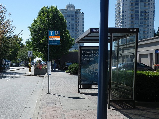
Starting this month and continuing through the week, bus stop signs in Surrey City Centre are getting a new look!
The design of the new signs, courtesy of TransLink’s Wayfinding experts, display more information and are easier to read.
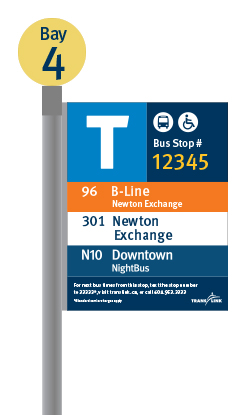
You’ll also notice something strangely familiar — the new look is consistent with other transit facilities across the system such as SkyTrain stations. The large “T” is for transit (of course!) and will make spotting a bus stop a breeze.

Rolling out the new bus stop signs will be a gradual process. To be cost effective, signage and schedules “infotubes” will only be changed out when the existing pieces reach end-of-life or are damaged or require updated route information. The full replacement of all bus stop signs and infotubes will take place over the next few years.
New bus stop signs
New bus stop signs will make it easier for customers to locate bus stops from a distance.
The “T” for transit, route numbers, Next Bus information and the bay number are placed in prominent locations. To differentiate from regular bus service, B-Line information will be highlighted in orange and NightBus in navy blue.
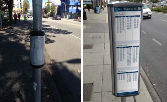
Schedule panels replace infotubes
Many bus stops currently have infotubes on the pole with schedule information, and riders generally give us good feedback about them. Sometimes, however, riders tell us the text is too small. We’re making improvements in this area by replacing the infotubes with schedule panels. The schedule panels are flat, contain larger text and have the same look and feel as the bus stop signs.

Keep your eyes open!
If you’re in Surrey City Centre over the next few days, make sure to check out the new signs. There are also a few new ones dotting other areas of the region, so keep your eyes open for them too!
Author: Jordan Keim


Could we settle on a consistent hour formatting to use for the new schedules on the poles? Some of them are 24 hour (various ones in Richmond) but others are 12 hour (Marine Drive Station). Choose one and stick to it!
Thanks for your comment, Joe!
I spoke with our wayfinding experts and they assured me that all schedule panels will use 12-hour clock format. The schedule panels displaying information in 24-hour clock format were part of an initial test run to help us determine which format we would adopt.
Oh Good, New Signs to destroy!!!!!!
Are the new signs going to have the Transit Security/police number on it?
JS, that’s a great idea. I’ve passed your suggestion along to our wayfinding experts. Thanks!
Hope there would be more of these signs in the Tri-Cities, Burnaby, and Vancouver shortly.
Hopefully this can be done as quickly as possible. It’s becoming ridiculous how many different types of signage Translink has right now across the system. Skytrain stations have different signage, bus stops in certain cities are different from cities next door, etc.
Why can’t we go with the 24-hour format?
Most countries print timetables using a 24-hour system. No need for bolding times to indicate p.m. or to add abbreviations.
I vote for 24-hour timetables!
Hi Morechi – we decided to adopt the 12-hour clock because not everyone who uses our transit system is familiar with the 24-hour clock. We want to ensure that taking a bus is as easy as possible for all of our customers.
Do you have a link to a design standard document for the new signs? The example bus stop shown looks quite cluttered to me, but it seems to be a demonstration of branding for three separate types of service, B-Line, daytime service, and NightBus. I imagine that a sign for multiple daytime routes won’t have the same dutch/irish colour theme.
Will frequent services be branded separately from other bus routes on the signs?
Hi Alan –
You’re correct – the illustration you are referring to is just a digital rendering to demonstrate how the individual bus services will be differentiated. Bus stops with multiple daytime routes (and no B-Line or NightBus services) will display the route information in white. Frequent service information will be displayed on the new scheduling panels.
Hope that helps!
I was wondering if Frequent Transit Network routes could be highlighted maybe in green or Yellowish orange perhaps? There seems to be no distinction between frequent routes and ones that run a few times a day on these new signs.
Will these bus stops replace the signs that say “Bus Stop” too? If they are that would be a big help!
I saw at Norcross Way and Ridgewood Drive but I don’t see the new timetable look. can you put it up please!