Friday fun poll: how do you want your real-time information on the new mobile site?
Friday fun poll: how do you want your real-time information on the new mobile site?
As promised, here’s the Friday fun poll about the new mobile site! Many of you have noticed and commented about the recent changes to the existing mobile site, and I’ve been passing on your questions and concerns to the team working on the new mobile website platform. The team tells me that they’re working hard to get the new mobile site up as soon as possible since they know the platform in its current state (i.e. being redirected to our Trip Planner site) isn’t ideal.
Building on the your input from our previous poll on the new mobile site, including optimizing performance, saving favourites and including enhanced maps, we’d like to know how you would like to get your information on the new platform.
The new mobile site will incorporate GPS technology. This will include GPS information from our fleet and GPS information from user’s smart phones. This new redesign will be optimized for mobile devices such as the iPhone, BlackBerry and Android devices. It will also be available in a generic mobile and desktop version.
Rolling out in stages, will hope this technology will eventually be able to tell transit users the actual location of each bus and approximately how long it will take to get to where they are by relaying information from each bus back to transit users via their mobile devices. This is a huge project, so new features will be rolled out incrementally in select areas of the system before they go system-wide. In the first phase of this project, users will be given bus locations via a map. Later on, functionality like predicted arrival times by stop will be added to the map and in text-based form.
The mobile team has been looking at mobile sites of other systems around the world to see what we can learn and apply to the design of our new mobile site. At the moment, the team has come up with three distinct ways users can use the future TransLink mobile site to get real-time information. I thought I’d use the Metropolitan Transportation Authority (New York City) mobile site as an example of possible options for the TransLink site since we haven’t decided on any one design yet and hope users like yourself can help in the design process through this poll. So here is how the current design of the new mobile site might work as far as how users can use the tools to get around.
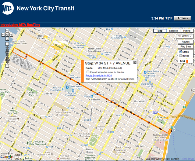
Real-time information by bus stop
The idea here is if users know the stop, they can find out which buses stop there. The map would show all the stops within a radius of your stop. The map below from the MTA website illustrates the idea with a green star.

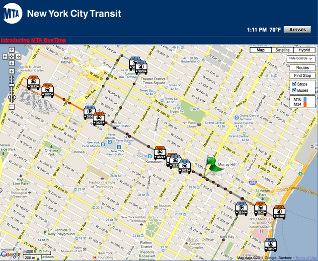
Real-time information by route

For the route option, the user knows the bus or route they want to take, and site maps shows which stops are closest to them. A map like this would show the route that users specified relative to their location (indicated by the green flag we added).
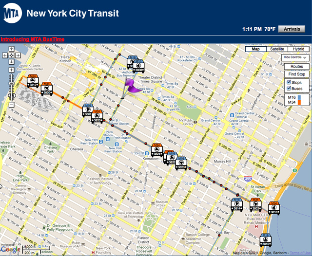
Real-time information by user location
Similar in result to the route option, the mobile team is also looking at providing a separate personal location option. With GPS locating a user on a map, the user could then find the transit options that are around them. The map would show users (identified by the added purple flag) where they are amongst all the bus stops and routes within a certain radius.

So now that we know the possible trip planning options of the new mobile and desktop site, we’d like you to help us figure out if these are the right options and how to display them.
|
Is searching for transit options by personal location of use to you?
Total Voters: 182 |
Because the GPS on buses will be rolled out incrementally, we need a way to show that the bus arrival times are either scheduled or real time.
|
How would you prefer to see scheduled times as compared to actual times?
Total Voters: 180 |
|
How often would you like the location of buses to be updated (remembering that there is a trade off between frequency and performance)
Total Voters: 184 |
I’ll tally up the results once the poll closes in two weeks’ time. This is by no means the only feedback you can provide on the future or existing mobile site. If there are comments that are not addressed in this post or poll, please do leave them below. This process is for making sure that we get this new mobile site right. I, too, will be using this new site, so I have a vested interested in it as well. I look forward to the results and feedback. Happy polling, everyone!


In regards to question 2, colours are usually difficult to use from a usability standpoint. People have various forms of colour-blindness, so using colours for some sort of important information usually leaves these people in the lurch.
Further, you have to take the devices people will be using into account. On my iPhone, colours get washed out in bright sunlight. Bright sunlight might be a concern in Vancouver if it ever comes!
Using some other means to differentiate between real-time and scheduled times would be better than using colours. Italicized fonts, or the suggested asterisk.
@brad
I’m color blind, but if the colors are different enough from each other, e.g. blue and yellow, there really shouldn’t be a problem. Now if they were like blue and purple then shame on translink lol
Why not both? Either use both colours and symbols or have an option to switch between them. You could even go as far as having the user select which colours they want to use (as there are many different types of colour-blindness).
When push comes to shove, however, and only one option must be selected, colour is my prefference.
Just make sure to have the colours contrast enough (perhaps bring in somebody who’s Red/Green colourblind) so that they can be differentiated.
This is overkill!
Maps is a huge luxury item. No wonder there’s a huge delay in implementing this and we had to wait for GPS licensing for the map technology. I hope there is an option to show the information without a map to suck up my phone bandwidth.
My vision is not much different than what we have today. Perhaps something like this would be perfect….
If you query my favourite stop 50181 (Main @ Terminal), you get
9:59pm 003 +5
10:00pm 019 -1
10:02pm 008 -2
10:13pm 003 +2
10:17pm 008 +10
The minus suffix numbers are minutes ahead of schedule. The plus suffix numbers are behind schedule.
What do others think of this simplified user interface? You get speed, you get bandwidth saving, and you have simplicity.
OK, if you can offer me a map at the bottom if I feel bandwidth rich and have time to look at it.
Why not simply Google Maps w/ real time bus information. Why spend a tonne re-inventing the wheel when we simply can send a data feed to google and get them to do the work for us?
I’d assume the real time information system is a standardized platform, as such, I don’t see a need to re-invent the wheel. Do it once and share the concept w/ other agencies.
Why isn’t there an option for “restore old TransLink mobile site functionality”?
I think you guys are focusing too much on map/trip planning for the mobile app. Google Maps comes standard on iPhone/Android/Blackberry and works great.
What people were trying to make clear on the last blog post is that the most desired feature is quick access to stop times.
Ideally, this is what I would like:
I hit my TransLink app, and I’m immediately greeted with a list of my favourite stop-route combinations and their next arrival times. (Just like the old iPhone app home screen.)
For other bus stop times based on my GPS location, I hit a ‘Bus’ button or similar at the top of the home screen.
From there, a screen like this should be displayed:
http://i.imgur.com/XEYZi.png
A list of the stops in close proximity to me, clearly telling me if it’s north/south/east/westbound.
I should then be able to tap on one of those stops, and be taken to a screen like this:
http://i.imgur.com/Wwg9B.png
Displaying the next bus arrival times for all routes, plus their next few in the future.
(Note here the WESTBOUND is now gone. Don’t do that.)
Now you may have noticed these screens look familiar. They’re only slightly modified versions of the current Trapeze system you’re redirecting users to now.
Another option is what Seoul does – say WHERE the next bus is (name of the last stop it was at) rather the estimated time of arrival.
That’s not much use though if you don’t know what the other stops on the route are named, which you have to assume most people don’t.
Andrew: I asked Cam Telford, a TransLink consultant on the new mobile site, your questions about using Google maps instead of a different map for the mobile site. Here’s his reply:
Google Transit does not have the capacity for real-time information at this time. As a result, our only option, since we provide Google Transit with scheduled information, is to seek alternatives.
I think Meraki should be designing the site! I would miss three buses by the time my BlackBerry loads a pretty map. This is typical TransLink overkill – we get SkyTrains and Subways but there’s no money for a bench or shelter.
Adrian: The benches & shelters are actually owned by the city, not Translink. Contact your local city hall’s engineering department if you want more benches & shelters. :)
I agree with simplifying the site. Build maps in the future. Right now all I want is some basic functionality back.
Robert: Has Cam considered working WITH Google to build this functionality?
“The benches & shelters are actually owned by the city, not Translink”
(….we’re getting off topic), and I understand the ownership, but it still doesn’t make SENSE. SkyTrain Station, Bus Loop, Park-and-Ride, Bus Stop Sign, Shelter, Bench. They are all part of the transit system.
Hi Cody: Cam tells me that TransLink has been actively working with Google trying to solve the problem of supplying real-time transit information via Google maps for some time. This is a very timely question. We’ve just today received word that Google now wants to do real-time transit on Google maps! We’ll keep you posted on our progress on this.
An option to override on the desktop site PLEASE! I am frustrated that I am forced to use the mobile site which is useful 80% of the time don’t get me wrong, but sometimes I need stuff from the desktop site!
How are you getting the mobile site? Many of us are trying to use it?
Until recently, there was a URL for the mobile site and a separate URL for the desktop site. The URL for the mobile site now redirects all of us to the Desktop site.
[…] TAKE ME TO THE POLL! […]
I use google maps exclusively to do trip planning. I’m sure Google will be adding real-time info as soon as standard protocols for communicating this are implemented by both parties. Hence I my “no” vote for “searching for transit options based on location”. G. Maps does this just fine and Translink shouldn’t be competing with them.
What I really need is fast access to arrival times at given stops, and this should be priority number 1. Here’s what I think was wrong with the old app:
– took FOREVER to load on my iPhone – this was a big issue for me, please speed it up if at all possible.
– only stored a (very) limited number of favourite stops
– couldn’t reorder or group stops
– didn’t give real-time info
The old app already had a “stops near you” feature – slow but adequate. Combined with the trip-planning ability of G. Maps, this is all I would need.
PS. have deleted the Translink app from my iPhone until the makeover is complete. Am now using iTransitVan, which has its own quirks, but at least lets me access schedule info and loads a heckuva lot faster than the old Translink app.
[…] been out for a couple of years and was also mentioned by Buzzer reader Reena in 2011. It has a couple of functions including finding nearby stops and listing all of the routes […]