Metro Vancouver bus routes pilot “stacked” destination signs
Metro Vancouver bus routes pilot “stacked” destination signs


Bus operator Fraser Doucette and Transit Supervisor Blake Webb believe in delivering great service to our customers. So, for them, making sure the destination signs on our buses provide clear route information simply makes sense.
“When I moved to Vancouver in 1971 from the Kootenays, every bus said where it was going, either the exact destination or the name of the street it ended on,” says Fraser, who has been driving our electric trolley buses in Vancouver for over 26 years. “You just knew where the bus went.”
But, with the increase in bus routes over the years, Fraser says things aren’t so clear anymore.
“Today, eighteen different bus routes say ‘Downtown,’ which can be confusing for our customers.”
And, for Blake, who joined Coast Mountain Bus Company as an operator in 2006, clear messaging always wins.
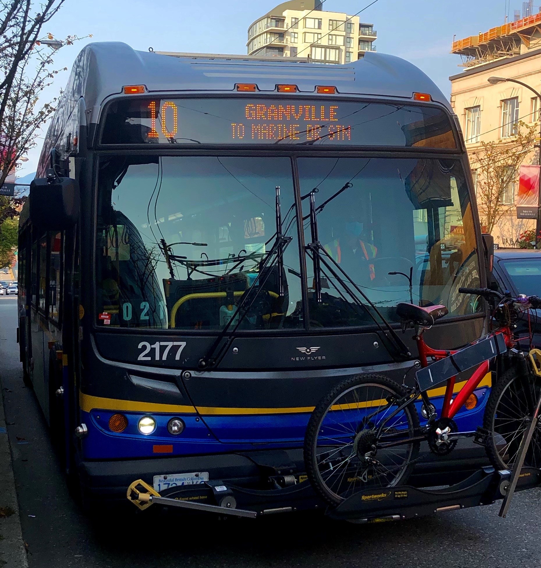
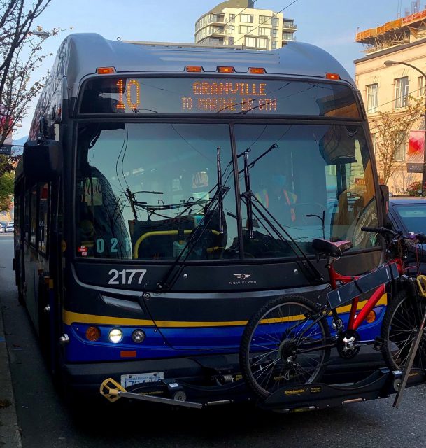
“I was at Marine Drive SkyTrain Station, which is a hub for tourists coming in from the airport,” Blake says, “and I noticed there were a bunch of buses on different routes that all say Downtown. So, if you’re not from Vancouver, you don’t know that Route 3 goes down Main Street or Route 10 is on Granville Street.”
He saw an opportunity for improvement.
“When you see something that can help people out, you do it.”
That’s exactly what Fraser and Blake did, submitting the suggestion to improve our destination signs through the bus company’s “Bright Ideas” call.
Since September 7, CMBC has been piloting “stacked” destination signs (two lines of text) on a handful of routes across the region.
“When Service Planning received the idea,” says Daniel Carreira, a service planner with Coast Mountain Bus Company, “we zoomed out and started thinking about it from a system-wide perspective, and not just routes that travel into Downtown Vancouver.”
Daniel says he and his team wanted to be consistent in providing more clarity and improving the usefulness of information displayed on buses across the region.
“We also looked at the destination sign practices of other large transit agencies in North America.”
Currently, the routes included in the pilot are 10 Granville, 119 Kingsway, 151 Como Lake Ave, and 325 140th Street.
Daniel says a big thanks goes to Derek Lee, who is a business systems analyst at TransLink, who helped problem solve the many unforeseen technical issues involved with displaying the new stacked signage. As we’ve covered in the past, programming destination signs is a herculean task.
“Since we did not have stacked destination signs on any routes prior to this, we had to work closely with Derek on making this possible. This is a significant departure from how we normally display destination information on our buses.”
What are your thoughts on “stacked” destination signs? Leave your thoughts for The Buzzer community in the comments below and submit it through our Customer Feedback for the Service Planning team.


too small – I am visually impaired and the signs are hard enough to read as it is!
It seems small and might be hard to see from a distance, in poor lighting conditions, or for those with sight issues.
Have you thought about alternating the sign between the larger text and and stacked text?
To be honest, I don’t like it at all due to too small on the message, some people might be hard to see the message at the front signs, I believe most of the passenger with the bigger font of the front signs as well~~
Also, 119 would be more confusion with 19 due to both of them go thru to Kingsway, some passengers might confuse which part of Kingsway are you going?? This is the reason why I think it’s failed for that if there are 2-3 routes go thru the same roads~~
I think the one on route 3 would be even better and informative to identify which one ends at Marine Drive Station and which one is the short run to 65th~~
Meanwhile, I think Translink can eliminate “To” on the front sign while you guys modified back to the bigger font, the reason is – it might be more confusion to identify the short run instead, example “10 Granville ” have short run to Marpole Loop, stack message would not make any sense at all~~
The other suggestion on the Rapid Bus to modify the sign message to let the passenger know that’s the Rapid Bus, for example “R1 Guildford / R1 King George Rapid”, “R2 Park Royal / Marine Dr Rapid”, “R3 Haney Place / Lougheed Rapid” etc…..
You forgot the 352 Ocean Park!
Agree with Sherman regarding visibility. Bus headsigns currently alternate “XX ANYWHERE” with “MASKS MANDATORY” – why can’t they alternate “3 DOWNTOWN” / “3 VIA MAIN ST”, for example. Problem solved and the sign remains readable.
I personally think it’s a concept worth exploring, but perhaps with some tweaks. Legibility could be an issue that others have already raised.
For example, with the Granville buses, while this is informative for the southbound buses, I spotted today a northbound bus displaying “10 Downtown to Waterfront Station”, which doesn’t actually provide the information that this bus runs along Granville.
Short turn runs could also be a bit problematic. One thing other transit systems have done with this is addressing this with labeled “branches”. I think one example of this already exists in Metro Vancouver, with the 250A out in West Van.
Finally, while this would be helpful with buses running largely in grids, this could be more complex with routes further in the suburbs that travel along multiple thoroughfares (eg. Surrey, the 335/326 come to mind), and buses running in married pairs within Vancouver (eg. the 4 running on Powell and W 4th)
Definitely an idea worth exploring, and I would like to see this discussed further, just a few issues that should probably be looked at with this.
Why are some of those routes with the “stacked” destination sign have spaces in between them
For Example, 323 1 2 8 S T R E E T. Aren’t the destination signs supposed to look other routes that you impmlemented on (10, 119, 151 & 325)