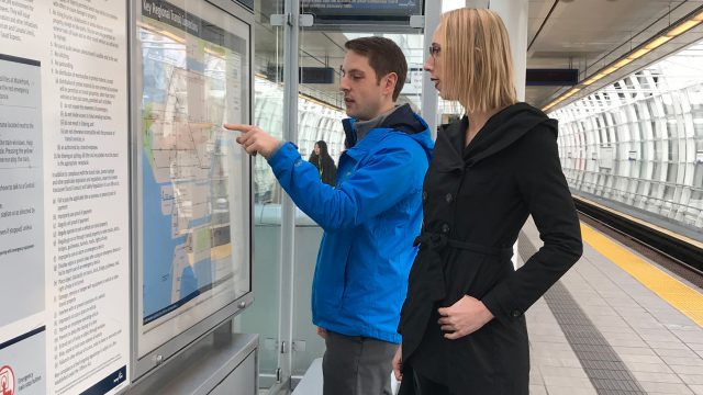
TransLink Wayfinding 101: who is the wayfinding team?
TransLink Wayfinding 101: who is the wayfinding team?


This is part of our ongoing Wayfinding 101 series taking a closer look at wayfinding at TransLink, bringing you the ins and outs, and answers to your questions.
Wayfinding is unique at TransLink compared to a typical transit agency. We bring together transit planners and graphic artists to design our suite of wayfinding tools—not simply one or the other.
“We’re not just making sure everything looks pretty or that the information is right,” says Phil Kehres, senior wayfinding specialist at TransLink. “We ensure both streams work together in harmony.”
On the planning side, they think about what information customers need at a specific facility and at what point in their wayfinding journey.
“It’s all about providing the right information at the right time and at the right place,” says Kehres, who holds a master’s degree in regional and urban planning from the University of California, Los Angeles. “At a SkyTrain station, for example, we simply provide the station name at the street level and as you progress through the station it gets more granular.”
The “T” symbol identifies a transit facility from afar, and once closer, the station entrance sign tells you the facility’s name (more on the T symbol in a future post). At the SkyTrain platform level, it gets more specific. We have identifiers telling customers the platform number and the terminus station for trains using that platform.
On the design side, it’s about fitting all that information onto signage, maps and diagrams in a way that’s clear, consistent and recognizable.
“We aim to create a recognizable identity for all our modes of transit, giving our riders visual confirmation that they are travelling towards their intended destination,” says Jada Stevens, wayfinding specialist and graphic artist at TransLink.
Adds Kehres, “Frankly, a lot of systems have beautiful signage or signage that’s there for the sake of branding a system, but they haven’t given much thought to why you need certain signage at a certain point.”
This integrated approach means many transit agencies nationally are looking to TransLink for inspiration and are referencing our TransLink Wayfinding Standards Manual, which was developed just prior to the 2010 Winter Olympics. It was also during this time when TransLink first established a wayfinding team and introduced the “T” symbol.
Today, TransLink’s wayfinding team consists of two planners and two graphic artists, including Kehres and Stevens. Rounding out the team are Edison Ting, a planner, and Elizabeth Wall, a graphic artist.
The wayfinding team is arguably the unsung hero of the transit system!
Well-designed wayfinding, both from a planning and graphic design perspective, means our more than half-a-million customers each day, are able to seamlessly get to where they need to go.
Author: Allen Tung


I’m really grateful TransLink has set the gold standard in Pacific Northwest transit wayfinding, but sure would be nice knowing at a tourist’s glance:
a) What train is for Surrey and what train links up with the Millennium Line?
b) How to transfer to the Millennium Line at Lougheed Town Centre. Got a little confused when I first got off the train.