Wayfinding 101: progressive disclosure
Wayfinding 101: progressive disclosure
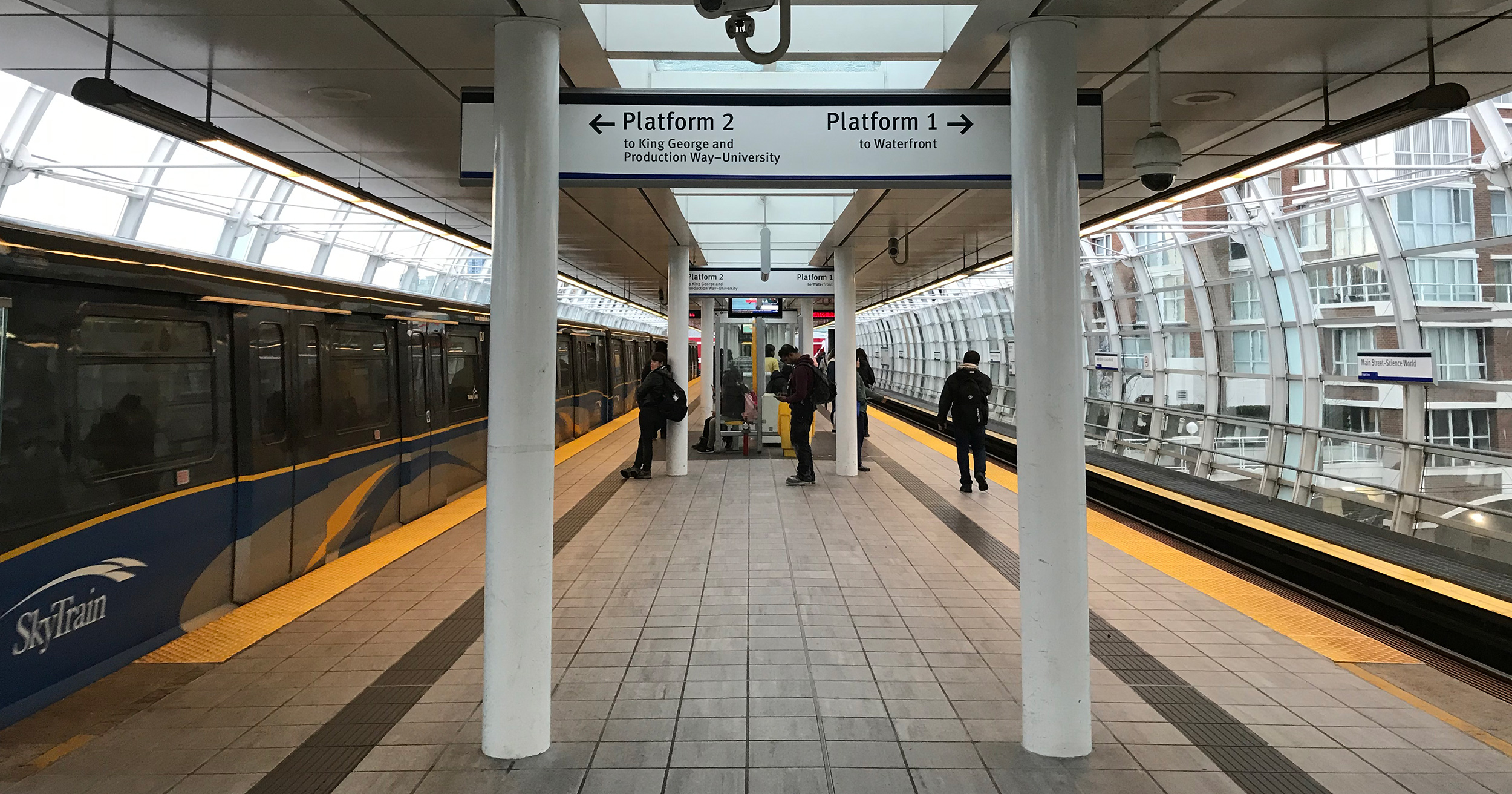

This is part of our ongoing Wayfinding 101 series taking a closer look at wayfinding at TransLink, bringing you the ins and outs, and answers to your questions.
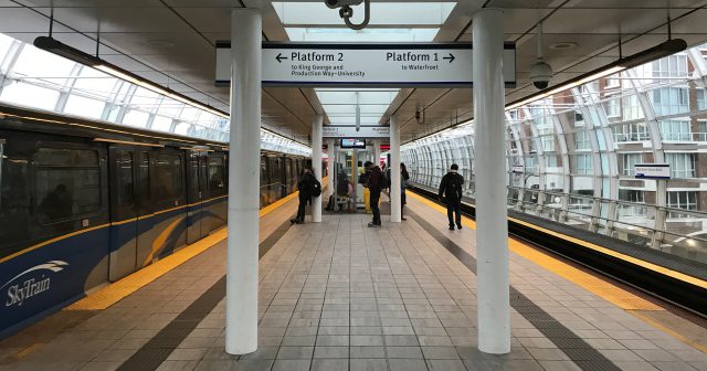
In our introductory post for the series, we talked about how wayfinding tools distill complex environments into easily navigable chunks for our customers by providing pertinent information only when needed. This is called progressive disclosure!
For example, if you are on the SkyTrain and planning to transfer to a B-Line bus, our in-car diagrams will show you the transfer stations to the B-Line, using the orange B-Line branding.
To confirm that you are travelling towards the B-Line stop, we use the same orange B-Line branding at all decision points as you exit a station. And you will recognize the B-Line stop as you will see the same branding on the bus stop sign.
“When all of these pieces are planned, designed and implemented correctly, our transit riders can depend on our wayfinding strategy to get them from point A to B, even if they have never taken transit in our region before,” says Jada Stevens, wayfinding specialist and graphic designer at TransLink.
As you can see, wayfinding planning is much more robust than simply dropping signs into a facility!
Our wayfinding team anticipates the different decision points for customers as they navigate through a facility and make sure we have the information they need to make that decision. To do this, transit facilities are split into different zones when planning.
Signage is planned according to the information customers are most likely to need in a given zone.
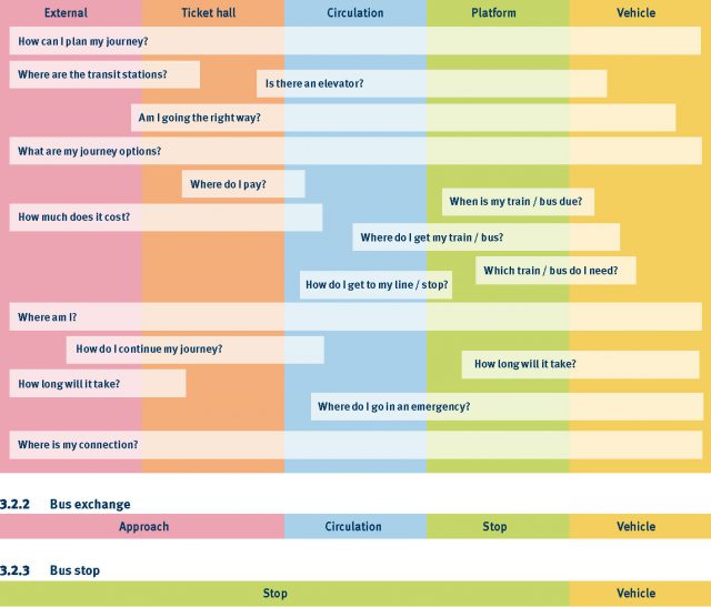
“We consider what questions a customer might have at each zone as they progress through the facility and that guides our planning,” explains Jada. “For example, we ask ourselves which zone customers will have the question of ‘How much does it cost’, then we plan our wayfinding accordingly.
Let’s take a walk through how wayfinding works in action!
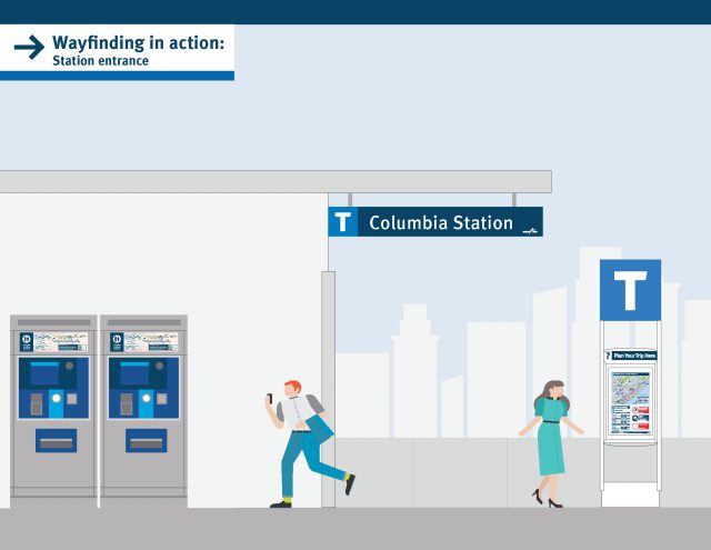
Station entrance
The T marker identifies the transit facility, making it easier to find from a distance, and a transit station entrance sign indicates the name of the facility. There’s also a sign with first and last train information.
Ticket hall
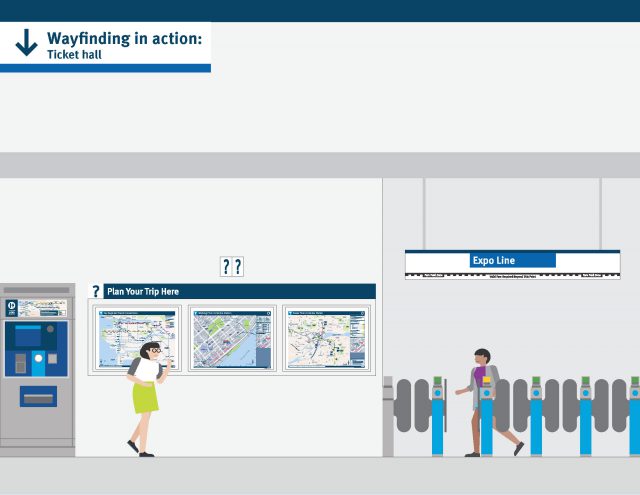
There are three types of maps found in our ticket halls aimed to help customers plan the rest of their trip. One map is for buses connecting to that station. Another map diagrams points of interest within walking distance from the station. The third map, the Metro Vancouver Transit Map, provides an overview of the entire transit system.
Maps found on Compass Vending Machines assist customers with determining how many zones they need to purchase for their fare.
Circulation
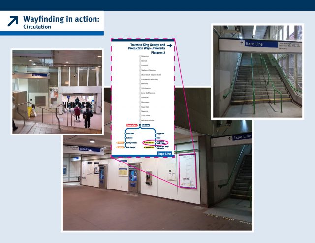
Once a customer has their fare, they begin to circulate through the station and wayfinding signage is in place to help them find the correct platform to catch their train.
Platform confirmation
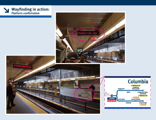
At the platform, Passenger Information Displays and Platform Line Diagrams confirms whether a customer is at the correct platform and ensures they board the right train for lines that have multiple terminuses.
In-car information
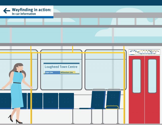
In-car line diagrams help the customer situate themselves where they are on the system and what services they can connect to at their destination station. Station identifiers visible from inside the SkyTrain vehicle along with onboard announcements help customers figure out what station they’re at.
Arrival station
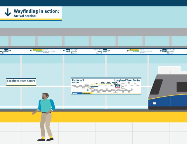
Station Identifiers and Line Diagrams confirm the station you’re at, and wayfinding signage is in place to help you exit the station. As you progress through the station, exit signage gets more specific.
Onward journey planning
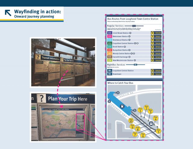
Maps showing Key Regional Connections, buses that depart from that facility, and points of interests within walking distance help customers with journey planning.
Bus transfer
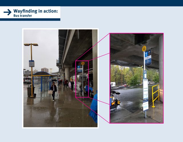
For customers transferring to bus, signage is in place to help them find their bus in the appropriate bay.

The World Cup of Transit Maps, 2018!
TransitMap.net is hosting a World Cup of Transit Maps, pitting 32 cities from around the world (12 from the Americas, 12 from Europe and eight from Asia) in a straight knock-out tournament!
Since April 4, they’ve been tweeting one matchup each day through @transitmap using the hashtag #wctransitmaps! Each poll will run for 24 hours, after which a winner will be declared.
Our SkyTrain system map is facing off against the Mexico City Metro today (Monday, April 9). Make sure you vote!
Match 7 – Let’s start week 2 of #wctransitmaps!
ROUND OF 32 – BLUE LINE MATCH 2
—-
Which city has the better transit map, Mexico City or Vancouver?(Comparison image and links below)
— Transit Maps (@transitmap) 9 April 2018


If you’re interested in improving wayfinding, how about you actually make it possible to tell what station you’re at when you’re on a train that’s stopped at a station? This is nearly impossible on the Expo Line as the signage with the station name is inconveniently placed so that it’s nearly invisible or completely obscured from a passenger’s vantage when a train is in the station, especially if there’s also a train on the opposite tracks.
This is a really obvious problem that hasn’t been fixed in the over 30 years the system has been operational. Pretty shameful if you ask me. If I’m on a train that’s dwelling at a station, I should be able to look out any window and with little to no effort see signage indicating where I am. How hard can that be?
Hi Joey, I reached out to our Wayfinding Team and here’s what they have to say:
The new signs at Expo and Millennium line stations looks good and useful and all, but I haven’t seen anything new at Canada line stations. It know it’s operated by another company, but as long as there’s different signs between lines of the same system, there will never be uniformity and you’ll always have an element of confusion for passengers.
Hi Mike, this is on our radar. One of the major goals of the wayfinding program is to provide consistent information across all lines and services. Now that Expo & Millennium Lines are mostly complete, we’ll be turning our attention to Canada Line, West Coast Express and SeaBus in hopes of achieving uniformity across the system. Stay tuned!
In the rush to put all this new signage up in SkyTrain stations, all the no smoking signs have been removed. More and more people seem to think no signs = smoking on platforms or stairs. How will you go about remedying this?
Hi Alan, I’m told we haven’t removed any “no smoking” signage and ones that were removed, were replaced with new signage. We’ve actually added/updated “no smoking” signage so the rules are clearly stated at the entrance of every station. As well, the project to update wayfinding took years of planning and design before we even got to implementation, then years to complete the installation. Hope this answers your question!
I’ve noticed that the yellow “stand behind yellow line/stay out of tracks” warning signs at Main Street-Science World Station are missing, and have been since the station renovations. It’s been a few months now since I’ve last visited there, so I don’t know if the situation has changed. Can you folks make sure that all essential safety signage is in place when working on the wayfinding signage upgrades?
Thanks for the update… I’ll keep my eyes peeled to see if the changes have improved things.
Actually, no smoking signage was removed from the platforms at both Columbia and New Westminster stations that I had noticed. Low and behold though, there was a brand new one at Columbia Station today. A single one to replace the 7-8 throughout the platform area that were there before.
Hi Alan and VancityAlex, I’ve passed this on to SkyTrain. Will update you folks when I hear back! :)
So I was in a train passing through one of the upgraded stations and the station name signs do seem to be much easier to see from inside the train, so kudos on that.
However, with respect to the “no smoking” signage: at Main St–Science World, there is no “no smoking” signage apparent in the interior of the ground level of the west stationhouse. At track level, there are only 4 such signs, two at the very west of the platform, facing each other, attached to the station walls (so potentially not visible if there’s a train in the station?) and two in the same configuration at the very east end of the platform. Those are very easy to miss… none of the interior elements seem to have signage reflecting the smoking restrictions.
Similarly at Metrotown, the east stationhouse had no “no smoking” signage at ground level save for a very small sign as you enter.
So… yes, I would say the prominence of the “no smoking” signage could be significantly improved (at least in those 3 cases).
Hi Allen,
Have you heard anything back yet? I was in New Westminster Station the other day, and aside from something on the emergency exit door, there is ZERO no smoking signage anywhere on the platform, the fence separating the rail lines, nothing at all. I would definitely say it was removed.
Hi Alan, I’ve followed up with SkyTrain. In the meantime, here’s what I can tell you: Because New West was one of the earliest stations with signage done according to the new standard, it’s possible that “no smoking” wasn’t included at the time. We still have some work to be completed there, so there is a chance to add this in.