
TransLink Wayfinding 101: story of the “T”
TransLink Wayfinding 101: story of the “T”
Think of the London Underground and you think of the blue, red and white roundel. Think of the Paris Métro and you think of the red lamppost sign with “Métro” in all-caps.
In Metro Vancouver, it’s the white “T” on a blue square that’s the primary symbol for transit, which was first introduced in late 2009, just prior to the 2010 Winter Olympics.
The Olympics’ arrival challenged TransLink to take a fresh look at how we do wayfinding. It took on a high priority as it was recognized that the transit system needed a unified look, with consistent, intuitive signage to ensure an optimum customer experience for residents and tourists alike.
How do we show our bus network, SkyTrain, SeaBus and West Coast Express are part a seamless, integrated transit system, and how do we make transit services easier to find?
“One of the overriding principles we had when designing our symbol was we wanted to communicate transit in Metro Vancouver is a cohesive system,” says Phil Kehres, senior wayfinding specialist at TransLink. “We had identifiers for specific services such as SkyTrain and buses, but what we were lacking a unifying symbol for all transit services.”
Many cities have opted for a big “M” for metro—another word for rapid transit—with at least 77 different designs worldwide, according to CityLab. In Metro Vancouver, the word “metro” hasn’t been part of our vernacular since we call our rapid transit system by its name, SkyTrain. That’s why we opted for an all-encompassing T for transit.
“In creating the T, we took inspiration from around the world to create a symbol that would not only become iconic for the region, but also conveyed unity,” says Kehres.
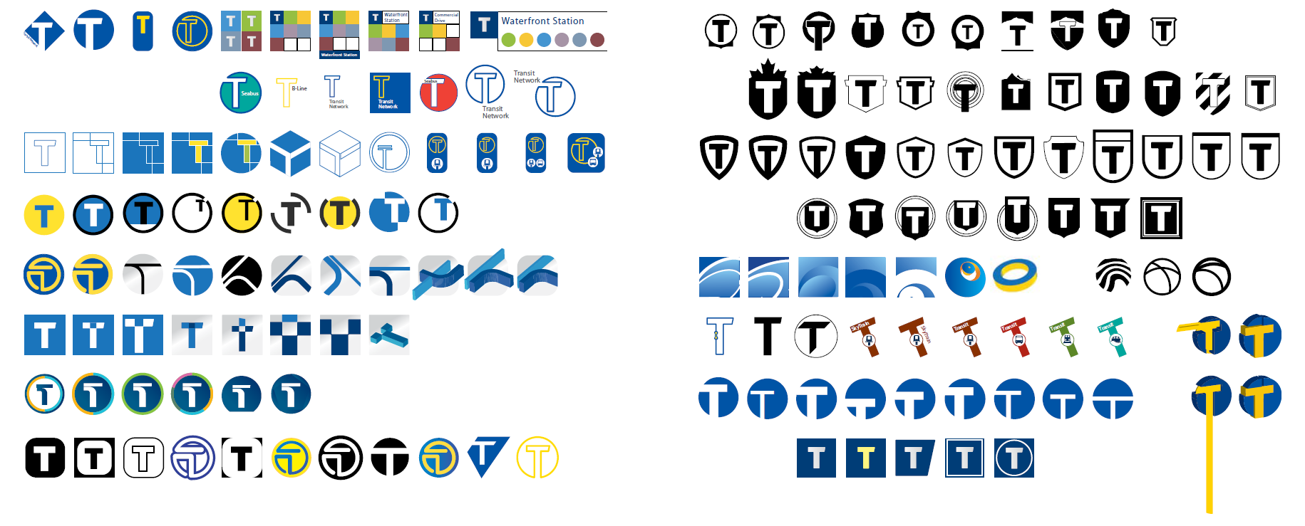
SkyTrain stations are underground in downtown Vancouver, which makes them difficult to spot from a distance. As well, finding “SkyTrain” or “bus stop” is challenging for someone who doesn’t understand English. Where you find the T is where you find transit regardless of mode.
Since 2009, we’ve been gradually introducing the T and associated wayfinding improvements throughout our transit system. In order to keep costs down, existing wayfinding signage is only replaced when it has reached the end of its useful life or as part of major upgrades.
The T is now found at SkyTrain stations, SeaBus terminals, Park and Ride facilities and a growing number of bus stops throughout the region.
The use of symbols extends beyond the T as all our transit services have a distinctive and consistent colour on all wayfinding. The Expo Line is blue, Millennium Line is yellow, Canada Line is teal, West Coast Express is purple, B-Line is orange and so on.
“Good wayfinding trains people by teaching them what to look for and where, through consistent design and location,” says Kehres. “No matter where you are in the region, you know to look for the T to find a transit facility. You know to look for and follow the blue lines or tabs for the Expo Line.”
So how did we arrive at the colours for the different lines on maps? It was, at least in part, inspired by the previous generation of wayfinding signage. It was blue on the Expo Line, yellow on the Millennium Line and teal blue on the Canada Line.
As adjacent and integrated development, and transit-oriented communities sprout up across the region around SkyTrain stations, the T is well on its way symbolize more than just transit, but also livability.