A little more about that colour green and our new buses
A little more about that colour green and our new buses
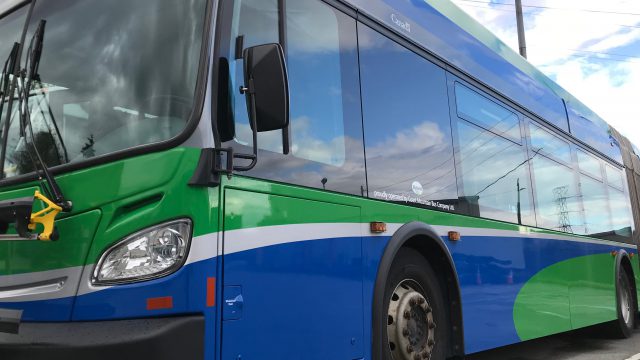

As we mentioned in a previous post, we’re changing the colour of our B-Lines when the new ones launch in late 2019.
Why introduce new colours?
This new green and blue colour scheme is about improving customer experience. We’re making it easier for customers to distinguish the B-Lines from the rest of our bus fleet by giving them a new look.
Colours, like maps and signage, are an important wayfinding tool. Wayfinding refers to information that guides people through physical environments and consists of a variety of elements – one of them being colour.
While colour preference is subjective, people agree it’s an important wayfinding tool. Colour gives people a visible way to identify a difference. For example, the new colours will give customers a visible way to distinguish a limited-stop B-Line service, from a regular bus.
How did we choose the colours?
We held two focus groups to help us determine the best colours. One group was conducted among relatively frequent bus riders – those who use the bus at least once a week. A second group was conducted among occasional bus riders – those who use the bus once a month or less frequently.
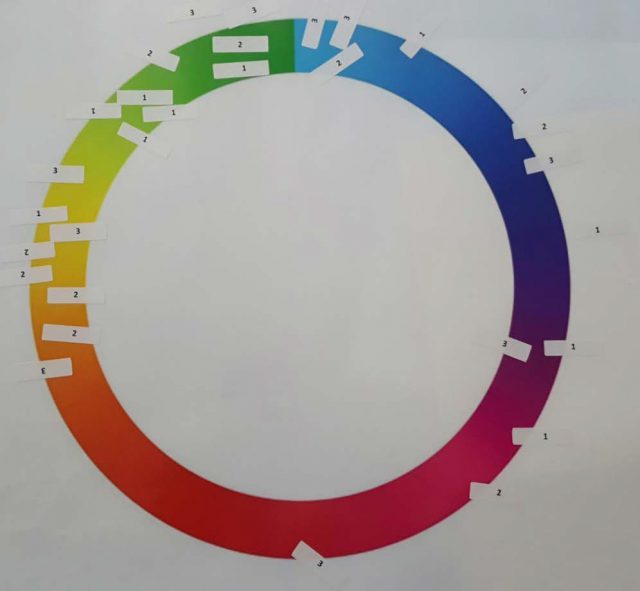
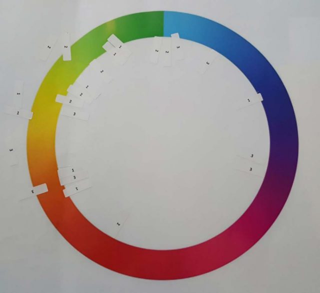
Customers were then given a colour wheel and asked to indicate the top three colours that they felt best communicated the benefits of this enhanced bus service. They marked their first choice with a ‘1’, their second choice with a ‘2’ and their third choice with a ‘3’. The slides that follow show customers’ selections.
When thinking about colours that are highly visible, convey movement, speed and reliability, both customer groups gravitated toward colours in the green-yellow spectrum as you can see from the colour wheels.

The reasons participants gave for preferring colours (and buses) in the green-yellow spectrum included:
- “High visibility”
- “You can see it coming from far away”
- “Like traffic lights, green means go”
- “Fast, speed, stands out from the current colours”
- “Green (and blue) are cooler colours, calmer for people – convey a message that it’s going to be smooth. Red is more angry”
- “I like the limey green because it reminds me of European fire trucks”
- “I like it, although I wish it was slightly darker.”
The one exception was orange. Orange was among the top colour choice for a number of participants. However, once customers saw a rendering of an orange bus, they no longer found it compelling:

Colours in the blue spectrum (and the blue bus) also resonated with some participants:
- “It means a soothing, cool, fast commute”.
- “It conveys a west coast vibe”.
- “Yeah, it’s good – it’s interesting”.

However, customers expressed concern that a bus in this colour might not be visible enough.
Buses in the red and purple spectrum weren’t well received by participants.

Once customers told us their preference was the green-yellow spectrum, we experimented with different colours of green.
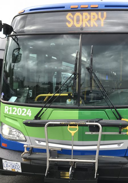
We also had to consider that if the green was too dark (like forest green), it would be hard to see. If a bus was too light (like lime green), it would show dirt quicker than darker green. Taking into account visibility and dirt, we landed on the green colour below.

Since colour is subjective, we know that not everyone will like the new green colour, but we hope this gives you a sense of how we got here.
Let us know what you think! We’d love to hear from you!
Author: Tanushree Pillai




If memory serves, the old #97/#98/#99 were printed in green on the TransLink system map, before the Canada Line opened. (AIUI the then-planned LRT to Coquitlam had already been given the name “Evergreen” in 2009, which is why the colour was changed.)
I like the Canucks blend you got there. Hope you keep it for years to come.
Also can you please replace that dirty dark grey on some of the SkyTrains to this? Better still – make the Millenium Line your shade of green and the Expo Line that same shade of blue and keep the Canada Line as-is.
If i recall, the old B-Lines like the 98 and 97 were coloured green on maps before the Canada Line. I suppose this could be considered a return to these old colours?
Also, is it confirmed that the name B-Line is sticking? It is a unique well-known name in Vancouver that holds weight for people and has become a distinct brand over the years.
Please don’t replace the B-Line branding. Calling it “rapidbus” is uninspired and unnecessary. It’s change for the sake of change, just a waste of money. As for the colours, again, it is uninspiring because blue and green is too safe and too common in Vancouver. Furthermore, this particular colour scheme is just a ripoff of Canucks team colours. Are the Canucks running the buses now? If people prefer green-yellow colours, then play around and use a combination of different shades. JUST DONT PAIR IT with the blue.
The idea of B-line buses being a different colour is great, but I expect it won’t last more than a few weeks (or days). Maintenance schedules, breakdowns and the usual rotation of buses from one route to another will inevitably mean 8000 series with the original blue B-line paint job, grey 8100s, 12000s, 15000s and 16000s will end up on B-line routes while the new green ones work other articulated routes like the 44, 49, 257 and 620.
How will it work if buses need to be swapped around? Then wouldn’t that confuse the riders?
Although not my favourite blend of colour, I understand why the colours are being changed. I don’t really a support a change in name though, the B-Line brand is strong in Vancouver and changing that would be a disservice and waste of money, not to mention confusing
Was so cool to see this article, especially the colour wheels and the different coloured buses, because it brought back memories of December 2017, as I was part of one of these focus groups. Was a lot of fun.
That’s great to know, Alan! Thanks for participating! ^tp
I liked the old Livery on the D60LFs better
Me too
I think everyone liked it.
That livery looks disgusting I like the b-line colors better