New maps and signs help improve wayfinding at YVR–Airport Station
New maps and signs help improve wayfinding at YVR–Airport Station


We’ve made it easier for tourists, many who are first-time transit users in Vancouver, to find their way from the Canada Line’s YVR–Airport Station!
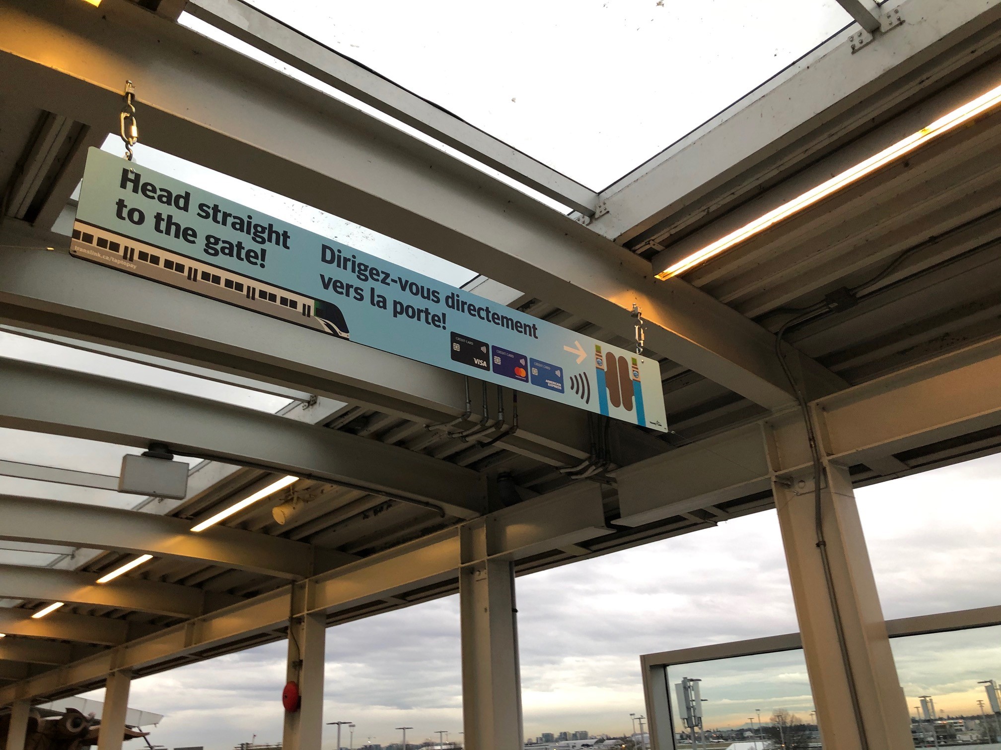
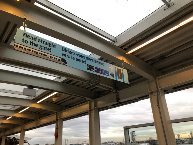
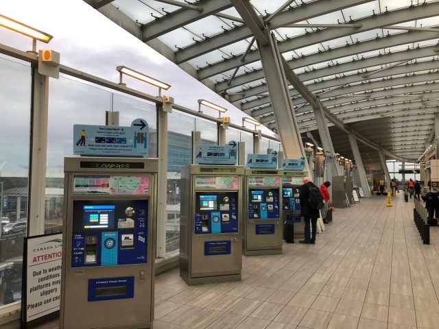
We want to be the best hosts that we can be, so that’s why we teamed up with YVR to improve signage at YVR–Airport Station to help customers decide what transit fare they need and how to pay for it. There’s now:
- Bilingual awareness signage conveying Tap to Pay benefit for travellers
- Maps with colour-coded fare zones
- Signage with fares to popular tourist destinations
With better signs, our hope is more customers will skip the lines for a Compass Vending Machines, head straight to the faregates and use Tap to Pay option to pay their transit fare using a contactless Visa, Mastercard or American Express credit card. For customers who are purchasing a fare from Compass Vending Machines, new colour-coded maps help with identifying fare zones for popular destinations such as the outlet mall, ferry terminals and cruise ship terminals.


Previously, Canada Line Attendants would sometimes have to help customers calculate the fare to popular tourist destinations such as downtown Vancouver, Canada Place and the ferry terminals. Now, with better signage, it’s clearer and all our customers can have a better experience at the YVR–Airport Station – and we’re still always there to help!
But the best part of all? The new signage was installed December 17th, 2019 – so we were ready for all of our city’s visitors this holiday season!
Author: Mohak Sood


I’d rather sell these folks (and fellow Vancouver tourists & transit fans) an all-day pass. One payment, all-day transit access, all zones, and all routes sure is a nice deal. But hey at least you’re getting folks to prefer transit over the single occupancy vehicle!
Interesting choice to list the 2-zone section before the 1-zone and 3-zone. Rather counter-intuitive upon examination, but I suppose this was done due to Vancouver’s popularity as a terminus.
The geometry and positioning of the anciliary text beneath each of those panels is misleading. On a quick read, one would be prone to infer that the $5 AddFare only applies to 1-zone (Richmond-terminating) trips. It looks like the graphic designer chose to align the boxes for convenience, rather than clarity of communication.
Incidentally, I’ve also wondered: is the tag line “Head straight to the gate” intended to be read in two different ways? In the context of an airport, the word “gate” invokes the airside departure gate—not a local transit fare gate. I imagine most customers, particularly visitors, would not think of “fare gate” when reading such a phrase.